The Idea
The website for the nine-physician Internal Medicine Office, Medical Specialists Associated (MSA), was overdue for a makeover. All that is needed is a look at the old homepage to understand why:
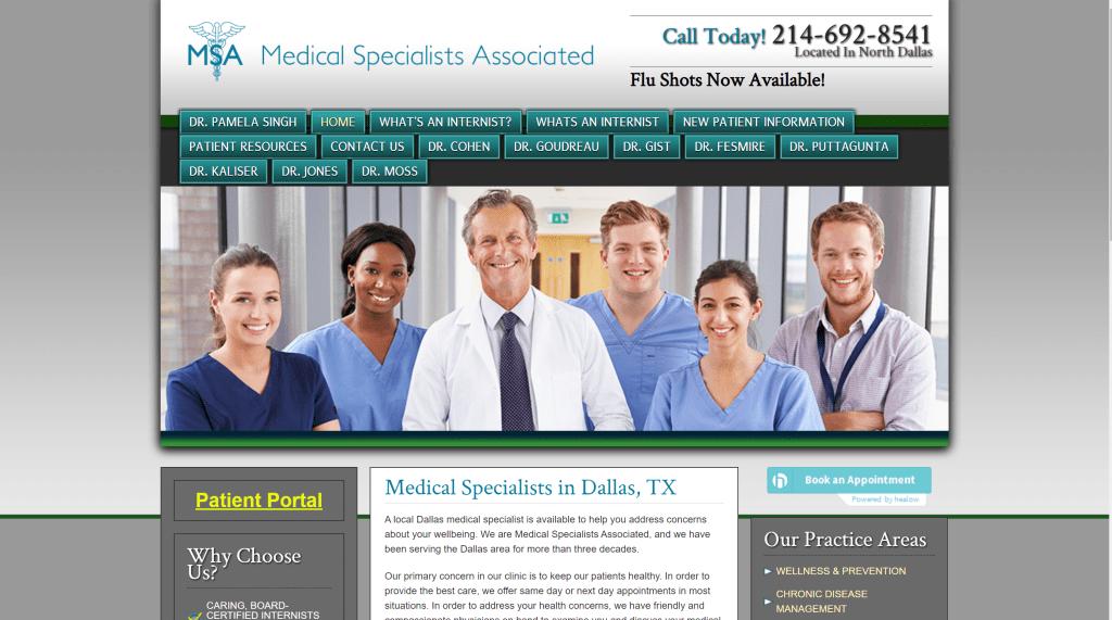
MSA’s Old Homepage
The past website included implicit issues: Too many links on the menu tab; Multiple links to similar information; Too much information on each page; Photos of doctors not part of MSA. In order to best accomplish reworking the website, I followed Click Here Labs’ approach to its mastering of the Scottish Rite Hospital’s website: simplicity and depth. The simplicity allows the website user to easily find what he or she is looking for while the depth better encourages future and current patients to utilize MSA’s services. I combined this concept of the website with MSA’s main purpose of the website, which is to gain new patients.
Implementation
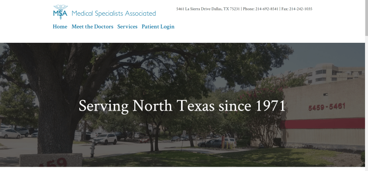
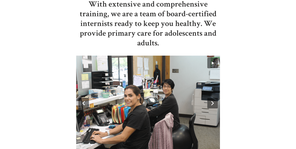
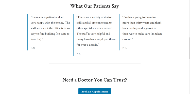
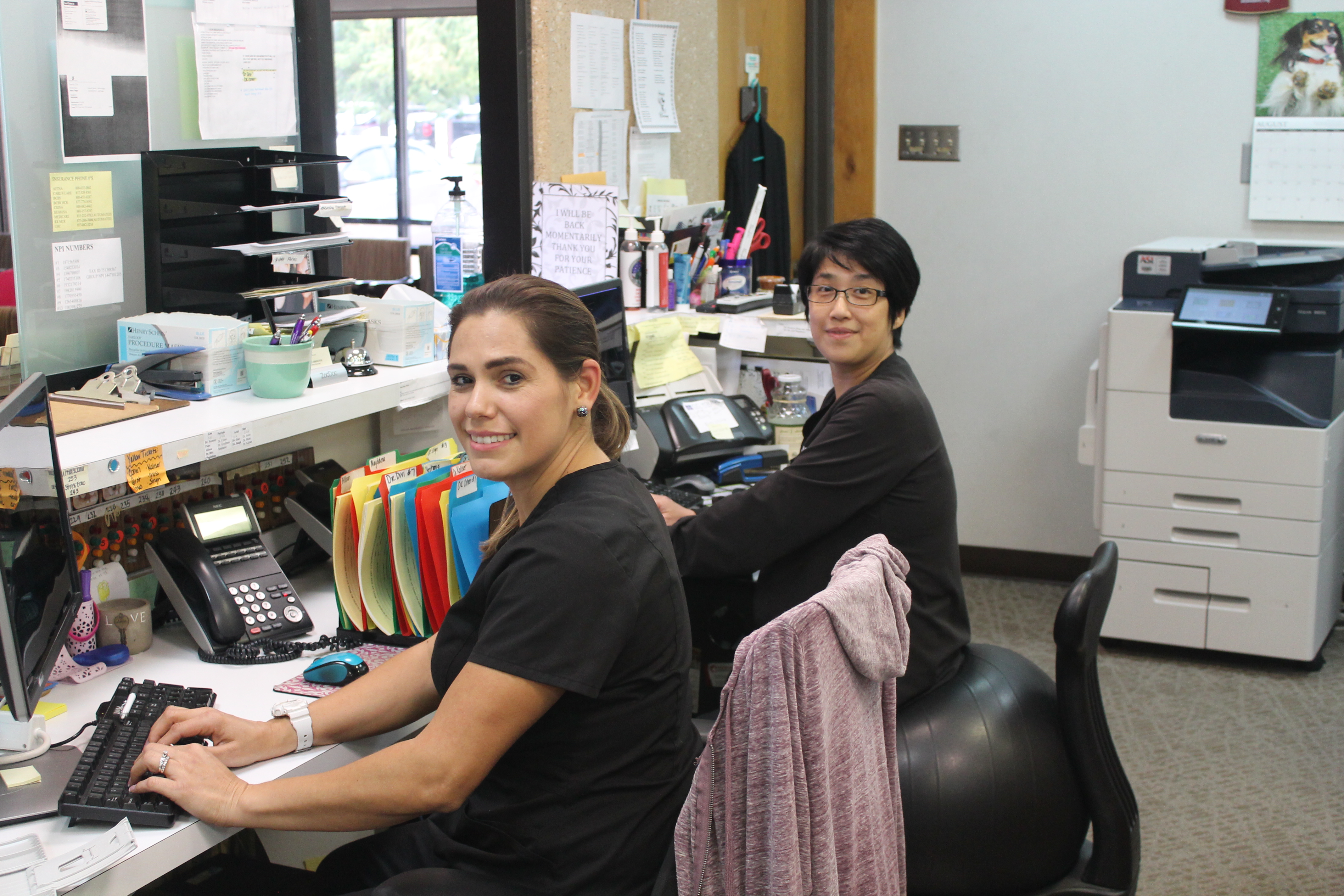
I analyzed and simplified the website’s flow of information for the best use of patients and physicians. I condensed the menu into four items. I fit all key information on one screen: MSA’s physical address and contact information, a photo of the building, and a summary of its pedigree. The following section of the homepage includes my original photos of the office, the staff, and office facilities. These pictures better engage patients and familiarize and endear them to MSA. Including photos of the staff other than the doctors increases employee moral. Next, the homepage includes quotes of previous and current patients complementing MSA. This better encourages patient commitment to MSA. The bottom of the page includes a link to book an appointment with MSA—the key mission of the website—and a Google Map link to the office for easy guidance to the office. Here are photos of the new homepage:

Then I created ways to draw current or future patients deeper into the website, making it more likely for them to utilize the services of MSA. The four links strategically lead the users to information they desire without being distracted by information not germane to their search. If they want an introduction to the doctors or know which doctor they want to book an appointment with, they click “Meet the Doctors” and then the particular link of the doctor they are interested in. The individual doctor’s page includes a short and information pertaining to his or her education and experience. Also included is a link to book an appointment with the specific doctor and another link to the doctor’s personalized patient form.
The other menu tabs lead to more information about services and a login page for patients. On the services page, the user may choose to inquire about MSA’s areas of practice, new-patient information, and accepted insurances. All of these pages are now separate, as opposed to being chunked together on the old website. Once again, the goal was simplicity and depth. So the user goes deeper into the website as he or she quickly finds the information pertinent to him or her.
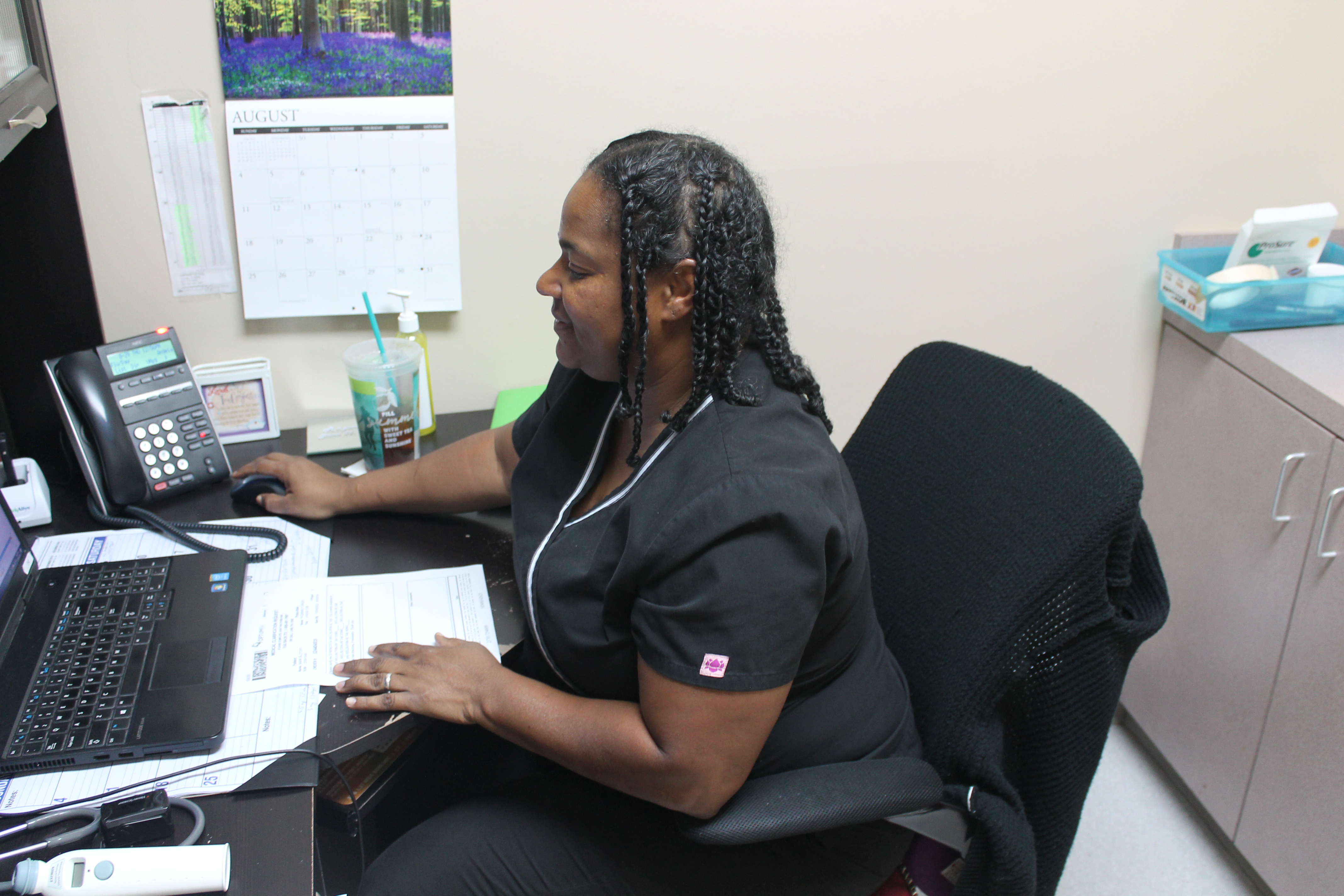
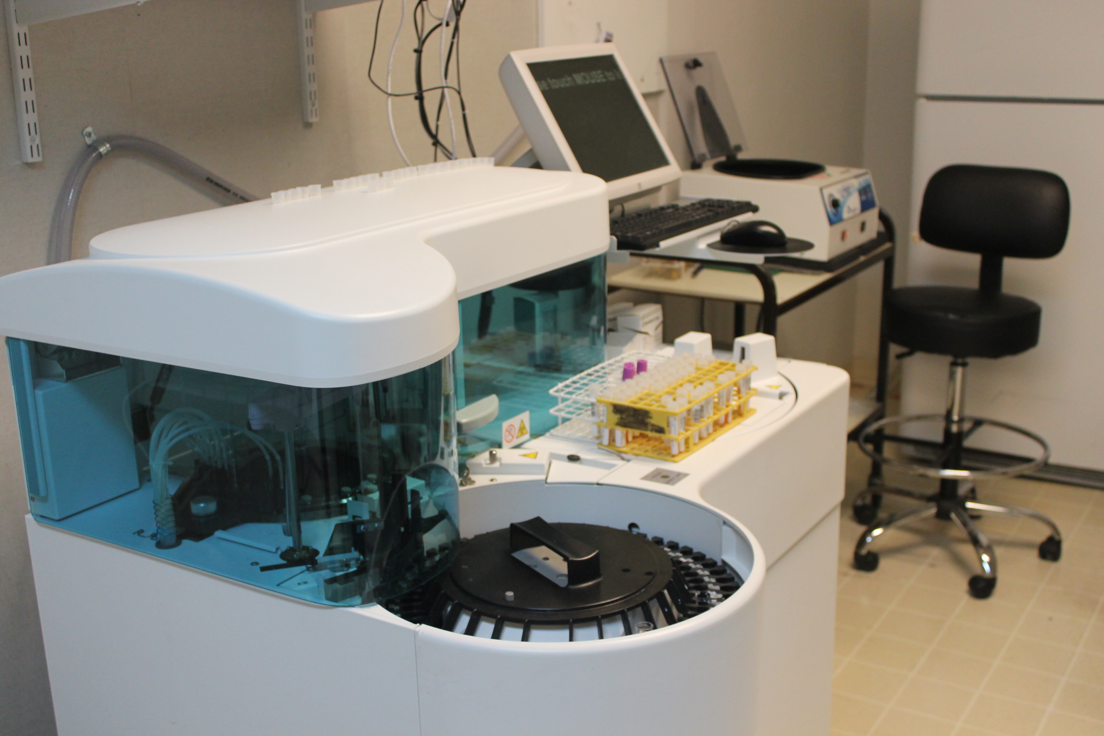
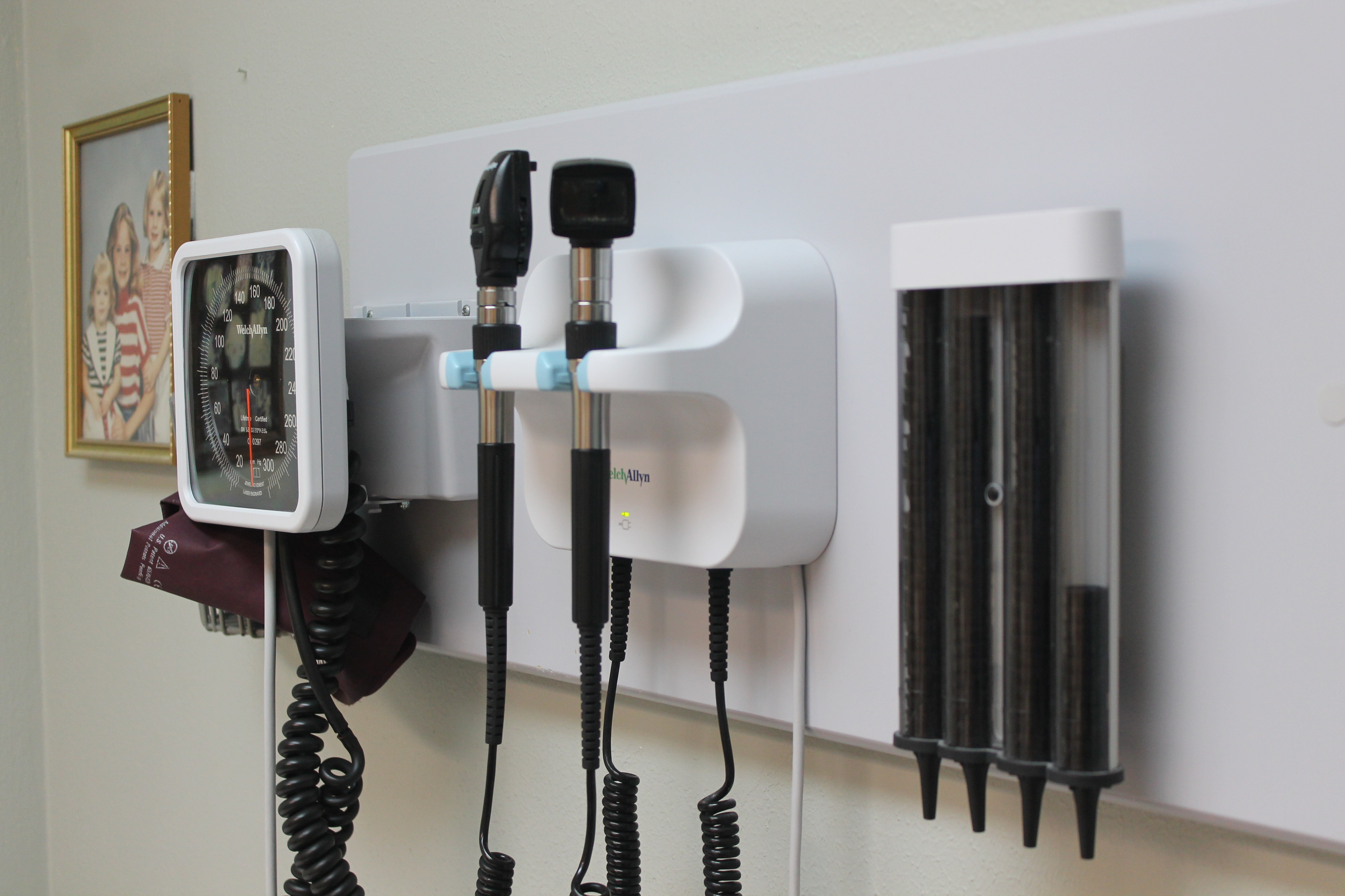
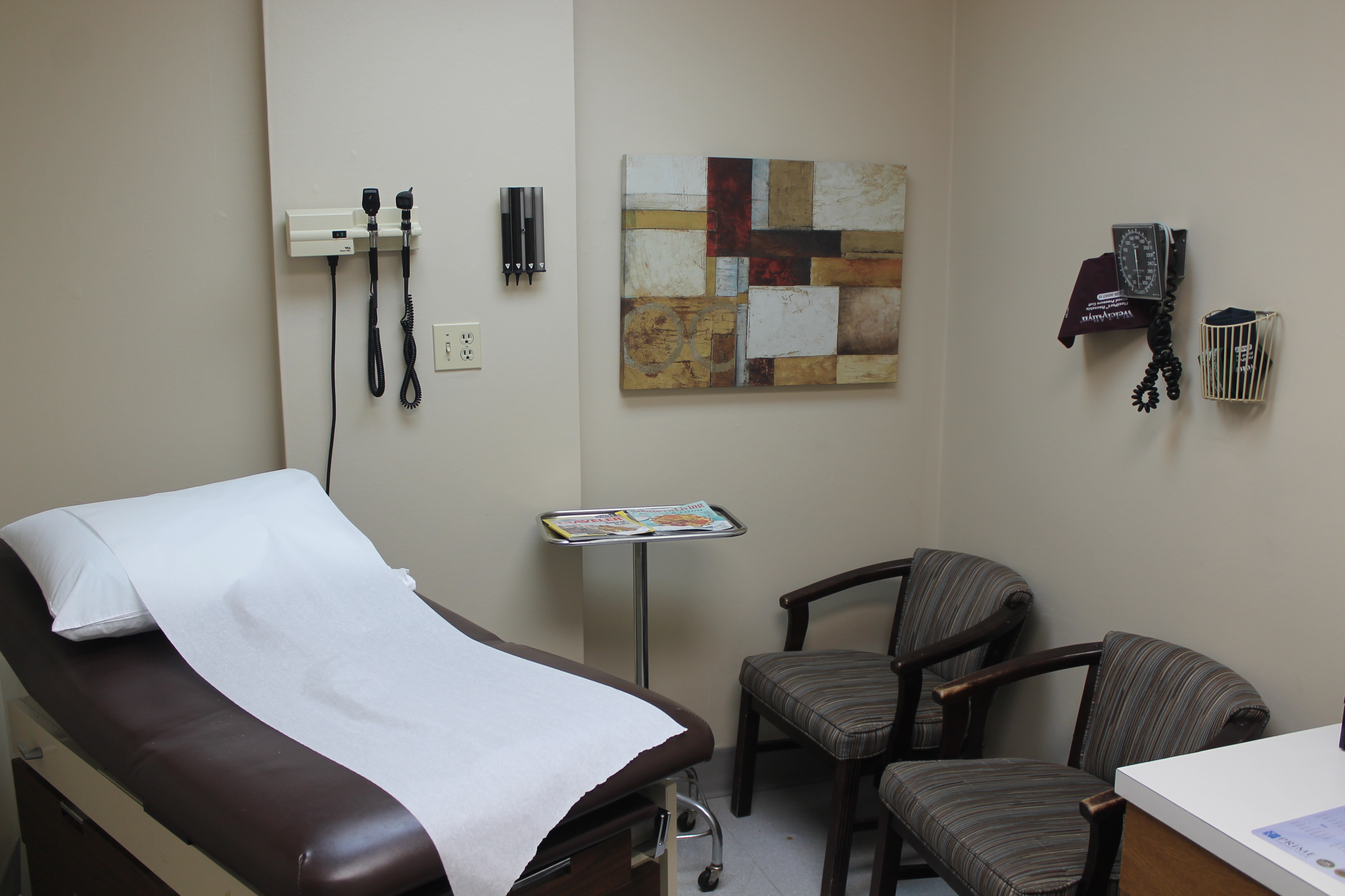
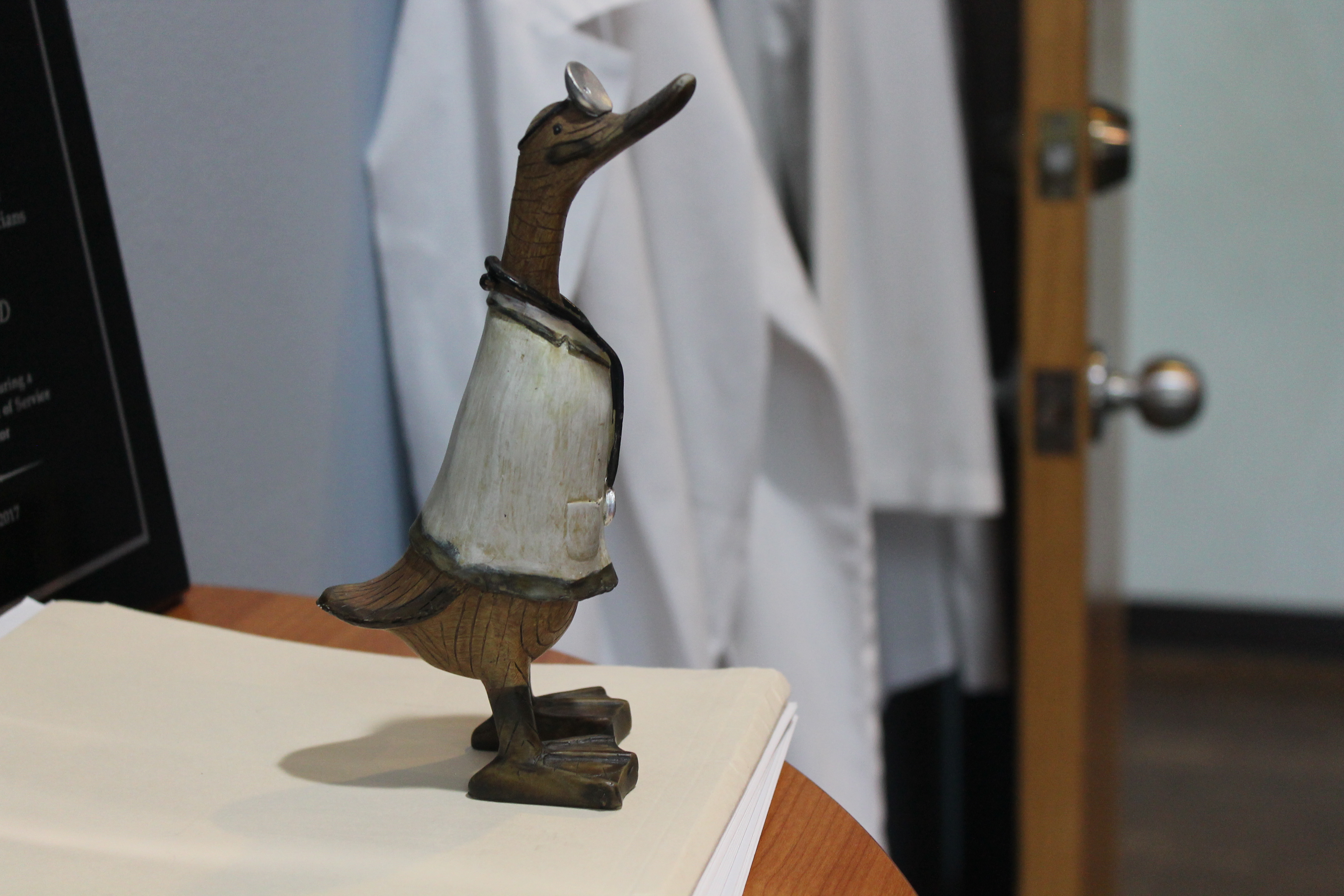
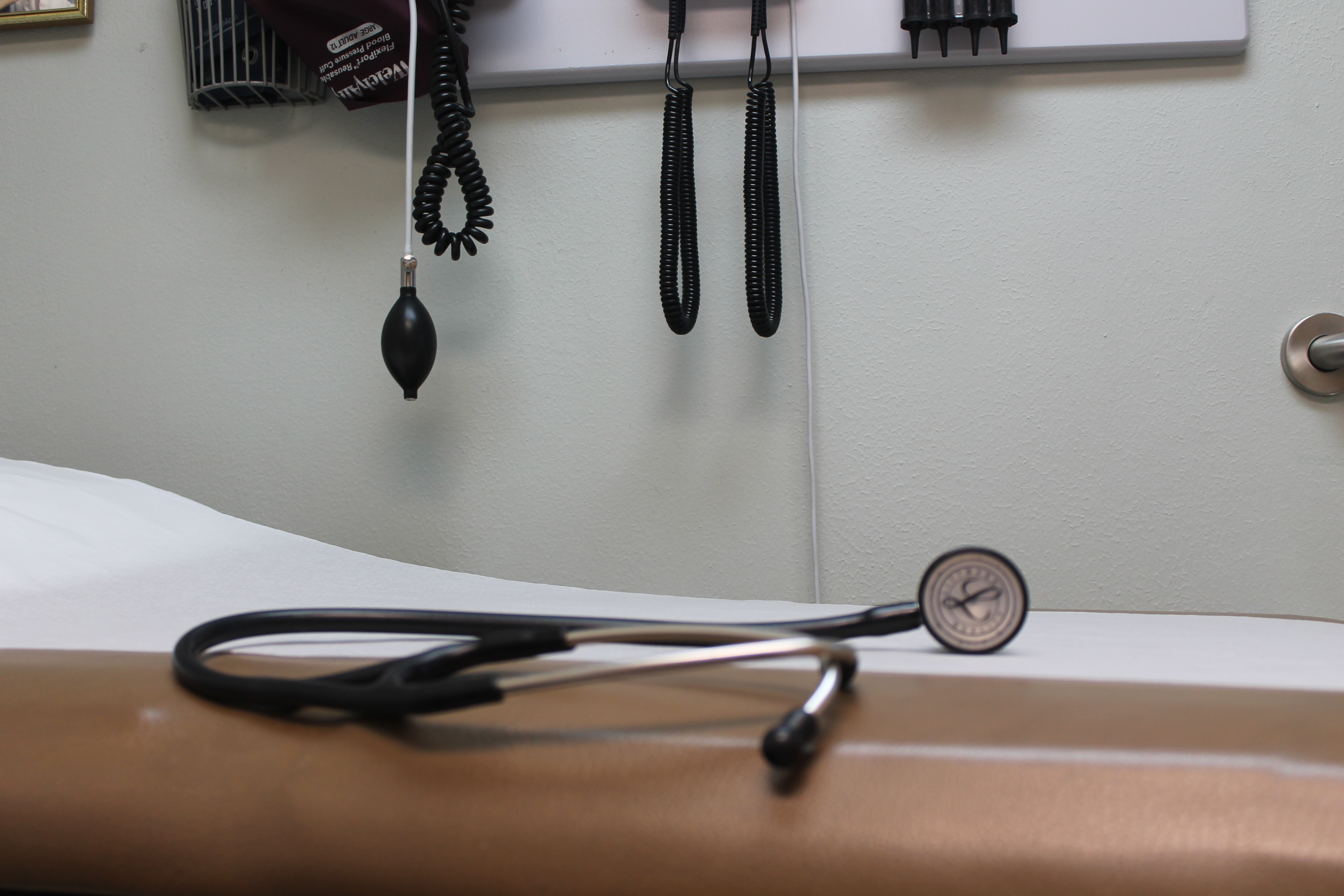
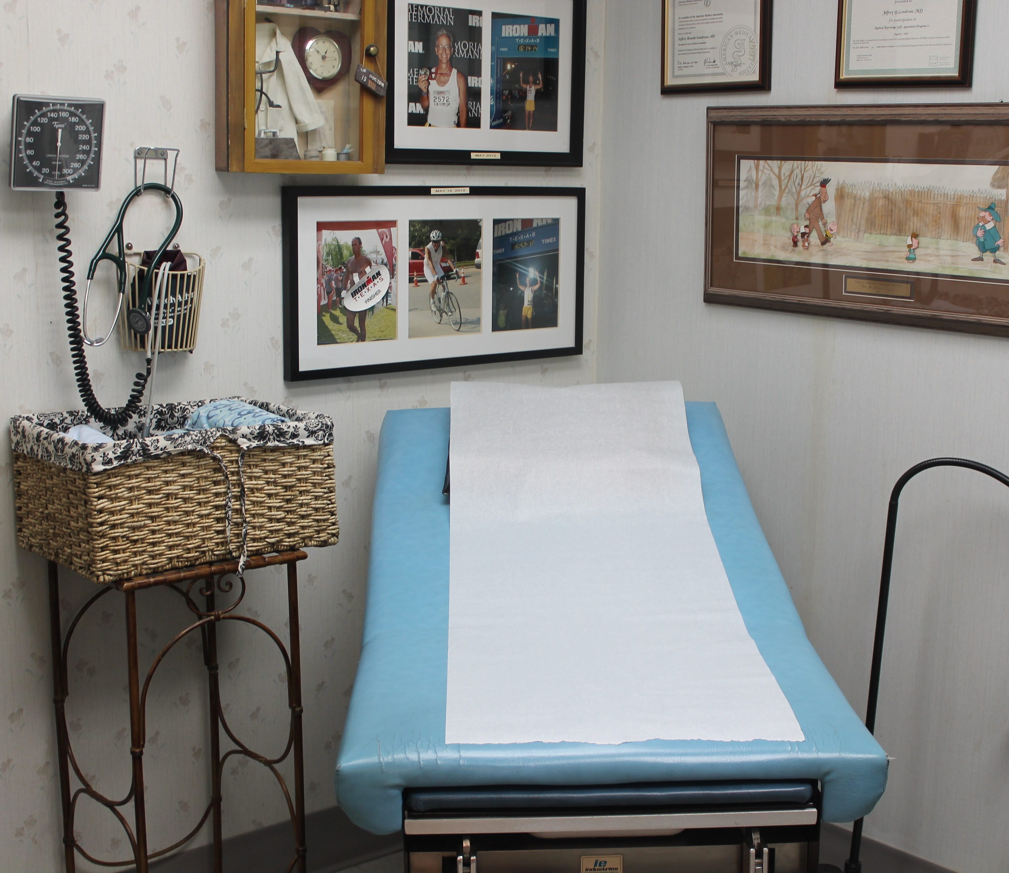
Check out some photos I took in preparation for the website:


Results
The results of the new website are:
- An extensively redesigned and modernized website for the physician practice website
- An analyzed and simplified flow of information of website for the best use of patients and physicians
- Content-edited pages of the website and much more concise information
- New and developed profiles for five physicians and original photos used throughout website
- The office’s physical address, the office’s contact information, and links to book appointments with doctors on every single page
- Staff trained on how to implement future changes to the website
Let’s write something together.
Contact me at: jonesbdlstx@gmail.com
